

How to enhance logo features
The most perfect figure of a person is to gain one point and be fat, and lose one point and be thin; The most perfect student is the combination of work and rest, and can retract and release freely; The most perfect wife is the upper hall and the lower kitchen; What about the most perfect logo? Is it easier to be less and more complicated? It's just right to hold it right. In this period, let's talk about how to enhance the features of logo. The reason why the name of this article is different from that in the preview, the addition is changed to enhancement, because many times we complete the logo optimization by reducing, deleting and weakening elements,just like transforming people,
Beauty,temperament and characteristics do not necessarily need to use the means of losing weight and losing face. Some people may need to gain weight and fill their faces! Then why enhance the logo feature? What are the ways to enhance logo features? Let's analyze it step by step!
- Motivation to enhance logo features
If a logo needs to be modified to enhance its features, there must be a problem with the original logo. This problem may occur within Party A's enterprise, or due to changes in the market environment, or the logo is found before the proposal of the design company, which will be adjusted and upgraded by the design company. Sometimes it's because the original scheme is outdated, and sometimes it's because the moral shape of the logo is good, but it's a little plain
Tasteless, which may cause the logo to be redone or modified on the original logo. The purpose of my article is not to explore why enterprises should optimize their logo (although I have written many reasons), but to let you learn how to make a plain logo wonderful. Well, there's too much nonsense. Let's go!
1.The evolution of the original logo caused by the formation of influence.
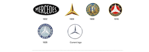
Now the world's well-known multinational companies have developed little by little. At the beginning of the establishment of these enterprises, due to their weak brand power, logos need to reflect their corporate culture and characteristics through more concrete and complex elements (before the modern design system was established, these logos were operated by people engaged in Art). For such logo evolution, it is more completed by deleting and integrating elements, The final purpose of such means is to strengthen the recognition of logo. The following cases are
The logo evolution diagram of giants in different countries and industries. We can see what elements these enterprises have retained and added in the process of logo evolution!
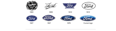
Evolution of Mercedes Benz logo
Evolution of shell logo

2.The trend upgrade of logo due to the improvement of public aesthetics and technological innovation caused by the change of time.
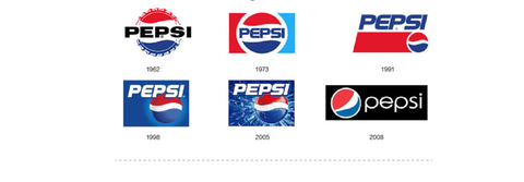
With the changes of the times, there are constant iterations in clothing, accessories, makeup style, hair modeling, architecture and industrial design, just like QQ Wechat and PS interfaces will be upgraded to optimize their appearance. These trends are often upgraded because of changes in people's aesthetics, and sometimes because of technological innovation, such as the invention of hair gel. As a result, hairstylists have created more classic shapes of different styles. The maturity of LED technology makes the colors of our mobile phones and other display screens more and more real and gorgeous! The application of heat transfer technology makes the outdoor sign text better realize the color gradient. These technological advances have brought unprecedented opportunities and challenges to designers. For this reason, the standards of beauty in each era are different. Those century old classic logos will follow the trend to upgrade with the change of the times, and this upgrade has a very strong modernity. We can take a look at the relationship between the brand upgrade year and brand identification style of the following three brands
Both apple and PepsiCo launched three-dimensional logos around the turn of the century, but they returned to flattening a few years later, and China's Huawei also went the same way.
Evolution of Apple logo

Evolution of PepsiCo logo
Evolution of Huawei logo

3.Brand upgrading after brand development and growth due to immature logo design due to lack of attention to image building or lack of funds to find a professional team during the entrepreneurial period.
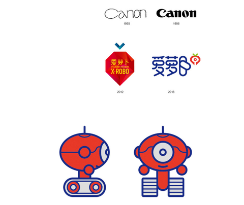
This one seems to be similar to the first two, but it is actually different. The first one is not necessarily ugly, but it is too complex and not concise. The second one is more about the aesthetic improvement caused by new technology. This one is really because the previous old logo is too ugly and the owner has money, so he can't hang on his face if he doesn't change it! Let's look at the following case. In fact, Canon's logo can be used in the plant skin care industry or leisure bar, but as a technology enterprise, it's almost interesting. AI radish is a guest I serve this year
Hu is one of the most professional robot education institutions in China. I won't say how ugly it was before. I redesigned the new VI and Si for him. You can see the image after the overall improvement from the GIF figure behind.
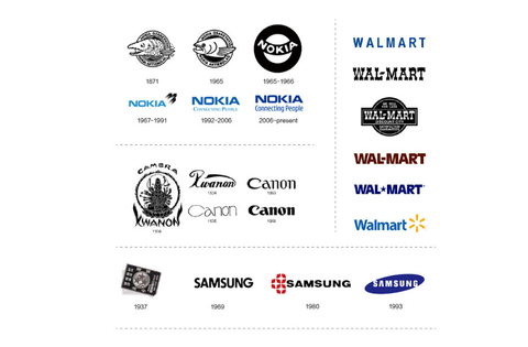
4.The development of enterprise internationalization leads to the evolution of letter based logo style.
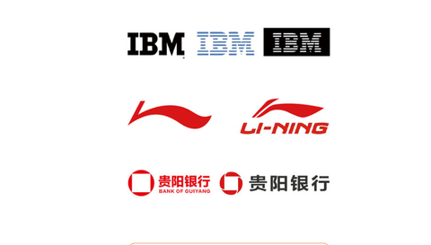
Because letter recognition has no national boundaries and is almost universal all over the world, many enterprises that have developed from regional markets to multinational groups have upgraded their original logo to letter logo Such upgrading and evolution leads to a very large proportion of logos with English letters as the main element of international enterprises. There are two different directions for the results after alphabetization. For example, the pure letter logos of Nokia and canon, and the letter + graphic feature logos of Samsung and Wal Mart, we will introduce specific cases and design methods in the next chapter.
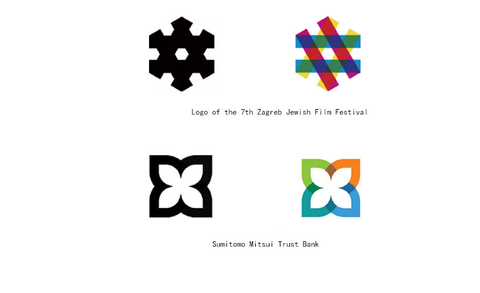
 5.Feature addition due to too simple graphics.
With the enhancement of brand protection awareness of small and medium-sized enterprises, more and more people register trademarks. Hundreds of thousands of logos are registered in China every year. Too concise graphics will lead to the lack of uniqueness of logos, which will lead to many similar logos on the terminal, which requires designers to carefully carve the logo at the beginning of design. Such a logo is often reflected in the relationship between elements, and the ingenious use of hierarchy and structure, so as to achieve the improvement of aesthetics and creativity without adding too many elements. The strengthening of such logo features is also the focus of this article. The following two cases are excellent cases with obvious features, but what did they look like before they added features? Maybe we'll explain it in detail in the next chapter!
Conclusion: the above is the motivation for the promotion of logo, that is, under what circumstances we need to operate on logo. Our next chapter mainly focuses on specific methods!
- Methods of enhancing logo features
There are many ways to enhance logo features. We have mentioned some in the motivation of logo upgrade in the previous paragraph. Sometimes these methods can be used alone or mixed. In this paragraph, let's talk in detail about the specific methods to enhance logo features and practice them. Not all of the methods described below are based on the "logo evolution of Party A's enterprise" as the reference and case. There are several cases that I subjectively restore the optimization process of the logo shape when the designer designs the logo.
Due to too many original logo elements or complex shapes, the logo is not integrated enough, the focus of attention is scattered, and the memory points are not concentrated. In a sense, the simpler the elements we see, the easier it is to remember. This is why so many party a prefer font library fonts to oversized design fonts. In the business field, every additional second of recognition and memory time virtually hinders the spread of the brand. Let's see what specific methods are used to reduce the characteristics.
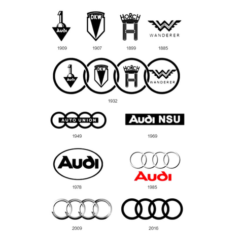
1-1 geometric generalization
Audi's logo simplifies the aesthetic complex graphics into four circles and uses four abstract circles to represent four different enterprises. In this way, the highly geometric generalization of complex elements is very worthy of reference. Both integrity and uniqueness have been greatly improved.
1-2 element integration
Summarize the different elements of the logo, organize the scattered elements into a full geometric figure, and complete the element focus. This method is used for the optimization of Yuantong logo. The number of elements is not reduced, but it becomes more concise and overall, easier to identify and apply, and the optimization of the geometry of elements (human parts) also plays a very important role in improving the overall image.

1-3. Align up and down
The composition of a sign is not only graphics, but also standard words, even slogans and web addresses. At this time, it is difficult to unify the height between different elements, even elements of the same type, such as some lowercase English letter combinations The result is that it looks a little messy and irregular. The optimization method is very simple. Please look at the following two cases. After the English part of South Korea is capitalized and the element position of store 1 is adjusted, it becomes more neat.

1-4 geometry of concrete elements
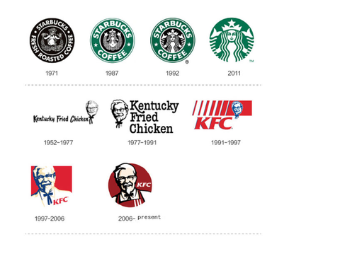
The simplification of the concrete logo is mainly completed through the geometric modeling of the original design and the deletion of the composition of the elements, so as to maintain the original identification symbols. In the early stage, the logos of KFC and Starbucks were more like comic illustrations with many details. Although they were vivid, they lacked the concise identification of the logo. The final optimization results evolved in the direction of "more concise and more craft", From the style of "artist and cartoonist" to the style of "craft designer and graphic designer", you will see fewer and fewer design results
Brush marks, while compass and triangle marks will be more and more. The two cases of Starbucks and KFC are very familiar to everyone, especially KFC. KFC's crazy opening of stores across the country should be in the late 1990s, so the logo that appeared earlier in China is version 97. Version 97 has simplified a lot of details than version 91, and the optimization of version 97 logo in version 06 is classic. It not only enhances its catering attributes, hair and facial features by adding aprons
Also more concise, lines are not only less, but also more exquisite!
 2.Element decomposition
Some logos are too plain, such as a pure letter logo, or -- a particularly concise Geometric Logo. Although it is concise, it lacks the taste of design. Some people criticize the design for the sake of design, but I think it is not good to try to extend the graphics in order to make the design result more design flavor? The cases in this part are to achieve the purpose of enhancing the recognition by decomposing one - element. Although they are not comprehensive, they hope to play a role of throwing bricks and attracting jade!
2-1 cutting decomposition
Cut the elements with one or more lines, making the text or graphic elements of the original logo more exclusive and recognizable, adding a bit of logical geometric beauty. Another advantage of cutting and decomposition is that it is convenient for us to color different small elements after splitting. With color contrast, the logo will be more eye-catching and more personality.
2-2 superposition decomposition
A graphic logo with geometric beauty can be divided into several different small elements. It is important to remember that this method is very important to find the split point. This split should keep the common area between the small elements, so as to have space for superposition effect.
Feature increase
The last part is to improve the characteristics of the logo by cutting elements. In this short paragraph, we mainly use addition to add a little to the plain elements to make your logo more characteristic.
3-1 adding vivid details of graphic logo
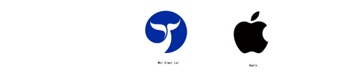
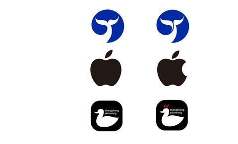
Brands should have their own unique genes. There are many logos with the same elements. You should make your own characteristics, such as the sun, wings, apples and ducks. They are very likely to appear in some industries. Sometimes they are caused by the same elements in the same industry, and sometimes they are caused by the same words or concrete words in the enterprise name, In the following case, Wei Siwei's tail bifurcation is - a beautiful and coordinated feature. The logo of Apple mobile phone was bitten - and the mouth is its highlight. everybody
You can see the comparison below. If the whale's tail is not forked and the apple is not bitten, it will be a dull apple and a lifeless whale. That duck is a duck neck chain in Changchun. Shangshang y is my work for 14 years. Several chili peppers on my head are like a crown - telling me that they are small fresh meat with spicy taste. In this way, some vivid details are added to the ordinary shape, so that the brand has its own more unique genes.
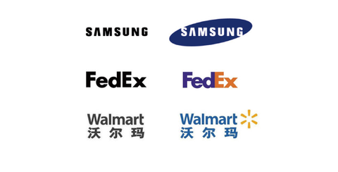
3-2 adding character logo feature elements
It's not difficult to design some basic English standard words as logos. Of course, we also need to learn. In the logo with text elements (today's cases are mainly in English), some classic cases become classics not only because the font design is good-looking, but also because of the addition of some characteristic elements. The following three groups of logos, if the characteristics outside the letters are removed, Didn't you feel it at all?
Summary: due to the limited space and tight time, everyone is usually busy these methods are sorted out here. Let's take a look at the cases optimized by these methods!
- Expanding practice
This section mainly uses my summary method to take you to practice, so that you can see the immediate effect, and I hope you can work as hard as me! Let's take a look at the following cases. They all use the methods introduced in this article. Let's take a look at my explanation as a review.
Anatomy

Like KFC, the previous design was too "comic" and realistic,I have geometrically processed this image. After processing, it is more like a logo. You can look at the dynamic diagram of GIF and simply understand the process and method of geometry.

The cross shaped logo is too common in the medical industry. Adding a ball does not solve the feature problem. I use the cutting decomposition method, which not only strengthens the original design in the feature, but also forms a butterfly shape.

Using the method of cutting decomposition, an overly simple geometric figure is decomposed into two parts, and a clever inversion effect is formed after adding color.

Cutting does not necessarily decompose. In this case, I found a cutting point with geometric logic and decomposed the elements into - half, which not only retains the original characteristics, but also increases the overall sense of the original design.

This is the logo proposal of "China Women's society". I first wrote a soft Chinese character, then cut out the "female" character symbol from it, and finally overlay it. You can see the application of this logo through GIF diagram.
1 comment
Great work