
Geometric relationship of lines
In addition to the geometric modeling of logo design, there is also a geometry, that is, geometric relationship. In the last article, we mainly talked about the geometry of modeling, while today we mainly talk about the geometric relationship of lines in geometric relationship. The geometric relations and geometric figures mentioned here are not exactly the same as those in mathematics, which I have summarized in many years of work experience. I think it's useful for my work, so I take it out alone for logical analysis and sorting. I hope this is not a rigorous theory. We don't go too hard to trace the source, because this is my thinking mode. Because I don't think from 0 to teach you how to achieve 100, but to find out how the works with 100 points start. This is a completely different thinking logic, as is the case with geometric relations and geometric graphics. I just analyze and summarize mature works and find the logic that makes me excited and happy. I'm willing to share this achievement with you.
一、 What are the geometric relationships in lines
Graphic design starts from the point, extends the line from the point, and then connects the surface from the line, which is the relationship between point, line and surface in the design. A point does not need to talk about its geometric relationship, because a single point element can form a geometric relationship with the picture, and a single point element without area does not constitute the basic condition of geometric relationship.
Geometric relationship refers to the position, distance and arrangement relationship between points, lines and surfaces in accordance with geometric laws. There are two factors: what happens here and who happens here. The elements in the geometric relationship are points, lines and faces. They can be the relationship between points, lines and lines, faces and faces, or intersecting points and lines, points and faces, lines and faces I
I won't list them one by one. Before moving on, I want to talk about the difference between points and surfaces. Point is a relative concept, because even a small point has an area. Can we call a small point surface? If the goal of our research is what shape the tiny point is and whether the tiny point is a standard geometric circle, at this time, even if the point is small, such as molecules and atoms, we will not study it as a point, but face to face or even as a body; For another example, we all know that the earth is large, and the "surface" of a country is amazing enough. If our research goal is to calculate the distance between the earth and the sun, or calculate the orbit of the moon around the earth, even if your surface is large, it is also a point; The line is the medium connecting points and surfaces. The line is composed of several points, and several lines form various shapes. Most of the time, we talk about the geometric relationship between points and lines, because we only look at the attributes of other points for smaller surfaces, while we mostly look at the relationship between other lines for larger surfaces. This - issue focuses on the geometric relationship between lines, and others will be launched one after another.
1.Parallel relationship between lines
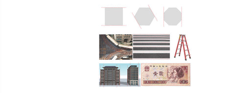
Parallelism is the most important and widely used concept of geometric relationship in logo design. Previously, the surface is extended by lines. You can find from the following case that even geometric figures are parallel on both sides. The parallel of lines means that the two lines extend in the same direction, and the distance between the two lines is always the same. The train tracks are parallel, the transverse plate of the ladder is parallel, the zebra crossing is parallel, and the contours of tall buildings and banknotes are parallel.
Parallel lines give people the feeling of stability, stretch and regularity. Dealing with the relationship between lines in the logo in a parallel way will make the logo look more stable and symmetrical as a whole. Here are some cases to decompose and talk about the classification of parallel lines:
▼ designer's "parallel" logo works
- Straight line parallel
Straight line parallelism generally refers to the equal distance between the adjacent two sides of the positive or negative shape of the logo. Often, such a logo will have multiple consecutive parallel lines, and the spacing between these parallel lines is the same, In case 1, the adjacent lines of each stroke of yellow "Mu" are parallel, and each stroke is guaranteed to be the same width, but the gap of gray stroke is much narrower, which makes the embodiment of letters more obvious; in the second case, "H" The white letter part of the logo is as wide as the red space part. In this way, the single letter logo will be more balanced and the positive and negative shape contrast will be more symmetrical; In case 3, the Microsoft logo highlights four color squares, so the cross parallel line in the middle is very thin. The last Nara logo wants to highlight the lines, so it is supplemented with a lot of emphasis.
- Parallel curve
Curve parallelism refers to the positive and negative shape. The adjacent lines on both sides form and maintain a parallel relationship through the cutting of parallel curves. The logo will present a regular and dynamic shape, with a very geometric beauty. Generally speaking, the curvature of parallel curves is very smooth, and it is very easy to draw with a normal circle.

- Integrated line parallel
The comprehensive line parallel refers to the parallel relationship between the two adjacent straight lines after turning, which increases the expressiveness of the parallel lines. In the logo of Standard Chartered Bank, we can see that the white spacing marked by the red dotted line is parallel, while a sharp corner appears on the left of the blue and green color block in the middle. The lines at this position are not parallel. I call it asymptotic relationship. Look
Here's my explanation.
The above three kinds of parallel lines are common. In the third kind of comprehensive parallel lines, you can see that the parallel relationship is still maintained after a straight turn.
- Line and line asymptotic (far)
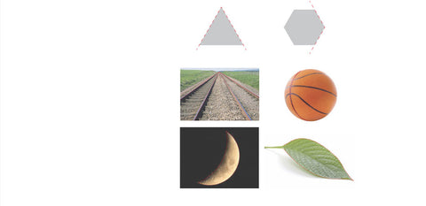
Asymptotic (far) relationship is the term in my tutorial. Of course, it is not an industry term. In fact, it is for better understanding. Gradually getting farther or closer, the relationship between the adjacent two sides of the geometry in the figure below is an asymptotic (far) relationship, that is, the asymptotic one end of the two lines will intersect, and the opposite direction will become infinite. The rail in the figure below is the asymptotic (far) relationship. In fact, the distance between the two rails of the rail is parallel. The asymptotic (far) relationship is due to the perspective. Similarly, due to the perspective caused by the circle, the parallel lines on the basketball also have an asymptotic (far) geometric relationship, while the contours of the crescent moon and leaves are asymptotic (far).
Asymptotic and distancing give people a smooth and comfortable feeling, full of motion and rhythm. It is precisely because of these characteristics of asymptotic (far) relationship that this relationship has become a common method in logo.
▼ designer's logo works of "gradually getting away"
- Asymptotic (far) geometric relationship of straight line
The main feature of this linear asymptotic (far) geometric relationship is that the two lines that produce the relationship are straight lines. The logos that meet this feature are generally companies with a certain sense of power and energy, and such linear geometric relationship is often copied and rotated. The third Maltese Airlines logo is four arrows, although not particularly full, But it also has very easy to identify features.
- Asymptotic (far) geometric relationship of curve
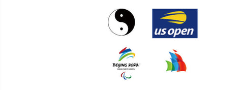
The curve asymptotic (far) geometric relationship has a strong visual tension. The rich changes of graphics can be reflected through smooth lines. The complementary graphics of Yin-Yang fish can be called a classic. If the author lives to now, he will win all the global design awards. The asymptotic (far) geometric relationship of the curve can also be combined by multiple graphics. The logo of 2022 Winter Olympic Games not only makes use of the asymptotic (far) geometric relationship of the curve, but also the color block superposition part has the characteristics of asymptotic (far).
- Unidirectional asymptotic (far) geometric relationship
The performance of unidirectional asymptotic (far) geometric relationship is to gradually increase the spacing from the narrowest to the widest, or a straight line or curve, or a single line or multiple lines. The expressive force is very rich, which can reflect the strong momentum of graphics, and has a strong sense of perspective and space.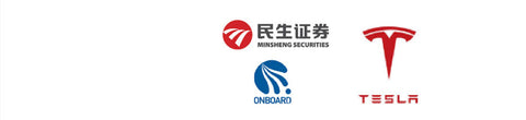
- Multiple asymptotic (far) geometric relations
The multiple asymptotic (far) relationship is that the curve changes from far to near several times to produce a very rhythmic sense of rhythm. You can observe the white lines in the middle of PepsiCo's new logo, from left to right, from near to far, and then from far to near. The seemingly simple white space is very full. After such white space cutting, the red and blue shapes also have their own modeling characteristics; The white part of the curve in Karamay district is more classic After several changes in distance and distance, it produces stacked wave lines, which seems complex and regular.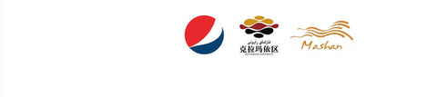
The above case is divided into four parts. 1.2 is easy to understand. 3.4 let me explain that the spacing change between the two curves of the logo composed of many curves is generally one-way. For example, Minsheng securities in 3, the three white lines are cut from top to bottom, from near to far, and until the end by a straight line; The multiple asymptotic (far) relationship in 4 is that the curve has undergone several far and near changes. You can observe the white line in the middle of PepsiCo logo, from left to right, from near to far, and then from far to near. The white curve in Karamay district has experienced several far and near changes. The asymptotic (far) geometric relationship will make the logo more dynamic and rhythmic, and make the cutting and connection of graphics and lines more natural.
二、Application of parallel and asymptotic (far) relation in logo
In the design, you should understand each method in depth and clarify its meaning and significance. Even if this method seems particularly simple, it will have a certain positive effect on your design. Today's topic is the parallel and asymptotic (far) relationship between lines. Let's see how to use these simple relationships.
There are many cases of abstract elements in the logo, but most of them are concrete, such as letters. When we are faced with a new design task, whether it is research positioning or market research, we will eventually fall on the graphic processing. The most important thing about the collection of elements before the creation of the logo is to determine what is the first element of the logo? If you determine the presentation element, what the element looks like is very important, which is directly related to the recognition and significance of your logo. It is the line that determines the shape of the element, so what the relationship between the lines looks like has become the object of our research. No matter whether the element is Chinese, English or graphics, we must pay attention to it
Establish clear line relationships. The following cases are very representative logos with parallel lines and asymptotic (far) lines as the main constituent elements.
- 1.design text with geometric relationship lines
As the most important identification symbol of the enterprise, the keyword in the enterprise name is the most widely used in the logo. The following cases are such logos. Although the elements vary greatly and the shapes are strange, the core shapes are the lines in line with the geometric relationship.
▼ English letters of geometric relationship line design
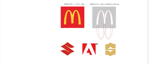
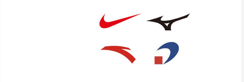
McDonald's logo uses asymptotic (far) geometric relationship. Is this asymptotic (far) geometric relationship drawn by path? The drawing method of the "m" element in the logo can be seen in the figure on the right. It can be designed simply by using four ellipses, which is the most basic geometric drawing method (of course, the standard drawing usually uses a positive circle). We can see that a line from top to bottom can be realized by changing the proportion and position of the inner and outer ellipses. Instead, parallel or asymptotic (far) can be used like this Alphabetic logos formed by geometric relations are everywhere.
▼ geometric relationship line design Chinese and numbers
Chinese and numbers are also the most important identification elements. Not all enterprises may have digital elements, but domestic enterprises have Chinese elements. When designing these elements, we should also pay attention to establishing a standardized geometric line relationship, or parallel or asymptotic (far), and pay attention to the symmetrical proportion of line width.
2 design graphics with geometric relationship lines
When we want to design a When designing a graphic mark, they will draw a sketch on paper. Experienced designers will pay attention to the geometric relationship of two adjacent lines in the sketch. Using lines with strong geometric relationship to design graphics will make the graphics more concise, and the graphic logo with geometric beauty will be more standardized and standard.
▼ concise graphic logo is a very representative form. The element that looks like a "face" is actually an exaggerated and artistically processed "line" with an area. Such a line is not a very thin line, but a line with a certain width and area. Such a logo is not easy to design into a stable appearance, so it is mostly used in sports and technology enterprises. And a thick line needs to move
For the sense of change, it must be inseparable from the assistance of asymptotic (far) lines. The cases in the figure below have such characteristics. Through the cutting of curves with different angles and radians, the shape of the color area between the curves presents a dynamic asymptotic (far) figure. The design of this logo should pay attention to the smooth and full changes of lines.
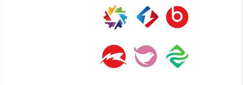
▼ concise figurative graphics have a highly generalized visual presentation. You can see that the lines of these shapes also use the asymptotic (far) geometric relationship of the lines, so the processed shapes will be more concise and have geometric beauty. From the standard drawing lines of the bird logo, it can be seen that the shapes cut by changing the position and size of the circle are very standard, In addition, the finished logo after cutting line is hidden, and the curve is very natural and smooth, which is impossible for many novice designers. The standard drawing method will be explained in detail in the future.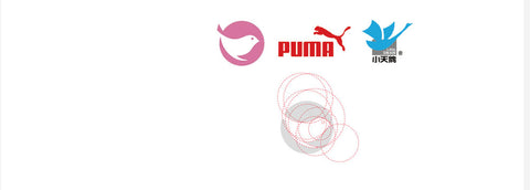
▼ realistic and figurative graphic logos mainly reflect different styles through the changes of sidelines. The fried dough twist is the fried dough twist. The following is a picture of the hair of the little sister in Starbucks logo. The hair is gradually related to the lines, and the part of the twist is parallel.

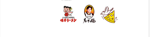
▼ the black edge of the drawing of Weigan Ramen is parallel, so the design theme is relatively clear and the whole is fresh and comfortable. Wei Xiaomei's grandmother's logo is directly a photo (we really can't choose not to eat this pot of sauce because her logo is too grounded), but the tracing still uses thick parallel lines, which is the only "design". My pizza logo has also been flat
Line stroke.
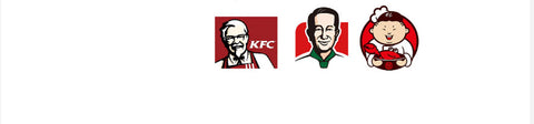
▼ the black edges of KFC and Mr. Li's drawings are asymptotic (far) lines. This treatment makes the avatar more three-dimensional and thick, while the crab three fat logo I designed uses comprehensive lines.
3 use the geometric relation line as the negative shape to cut the positive shape
▼ in addition to using geometric lines to represent a positive shape, the negative shape of geometric lines also has very strong expressiveness. If we use negative shape to cut a theme, what effect will it have. In the case in the following figure, the negative space of the case in row -- is a parallel negative shape to cut a geometry. In the second row of cases, the asymptotic (far) pattern negative shape is used to cut a geometric figure, and the third row
The blank space in the middle of the two cases seems to be parallel, but it is slightly expanded at the junction of both sides and the rectangle, reflecting a slight rhythmic change in the overall balance.
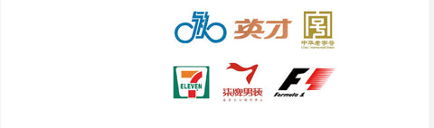
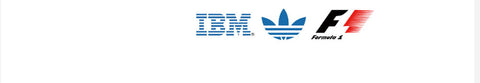
▼ similarly, the negative cutting method of geometric lines also has another form. It is to cut the theme with multiple parallel negative shapes, which not only improves the characteristics, but also gives people a sense of speed. In Figure 3, the logo of F1 racing car uses the line of linear asymptotic relationship.
- Set off with geometric lines - a theme
▼ in many logos, it is also common to use parallel or asymptotic (far) lines to set off -- a theme. This type of font is mostly logo (food). The case in the figure below is to use parallel and gradually distant lines to set off the font of a logo. Make the whole look more dynamic. In the same design, pay special attention to the smoothness and fullness of lines.
- Use geometric lines to divide color blocks in a geometric figure
As shown in the figure below, use a straight line (the first line) or curve (the second line) to cut several asymptotic (far) blocks in the geometry and fill in different color effects. It can make the geometric figures without characteristics glow with new vitality. Today, when the logo of basic geometric figures is not easy to register, the internal changes bring infinite possibilities to designers, retain the concise characteristics of the outside, and are full of creativity and expressiveness.
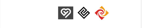
- Show an element by winding with geometric lines
The geometric line can not only be presented as a positive shape or as a negative shape, but also strengthen a theme through the method of convolution and winding. This theme can be a concise concrete symbol (heart shape in Figure 1) or a letter (E "in Figure 2). Of course, it can also be an abstract figure.
Summary: this part mainly presents the application of parallel and asymptotic (far) relationship in logo. The space is limited and the time is tight. I hope you can give me more valuable opinions
How to make your logo more geometric
The significance of geometric arrangement in logo design
Related posts
A logo that blends text and graphics
How to make your logo more geometric
How to enhance logo features
2 Comments
Awesome explanation
Awesome explanation