How to design a full logo
How difficult is logo design? Many designers have been working for more than ten years and still can't achieve the professional level. It's difficult to break through the bottleneck. They make a logo that looks uncomfortable but doesn't know where the problem is.
I sorted out a series of articles in the self inspection Encyclopedia of logo design problems, which are mainly used to solve problems. When you know that the logo is not good-looking and you don't know how to optimize it, you can come to my encyclopedia.
My tutorial: what I care about most is whether I can summarize simple and effective methods to save time, reduce the difficulty of memory and solve your problems more efficiently. Our purpose is to teach you to self check the logo problem and provide optimization ideas and case reference.
Well, just talk and not practice fake moves. Let's start looking up our encyclopedia!
A good logo is a full logo
Logo design has many different dimensions and styles, but more than 80% of logos in the world are full. Plump and simple understanding is that when the length width ratio is as small as possible, the blank area between the orthomorphic part of the colored part of the logo and the external geometric structure line is relatively small. There are several key words in this full concept description: length width ratio, orthomorphism, external geometric structure line and blank area. Let's see what these key words mean first.
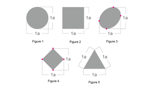
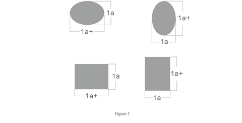
We use a as the unit to measure the length width ratio of the logo. In Figure 1 and Figure 2, the length width ratio of the positive circle and the square is 1:1. The same length width ratio is the proportion with the smallest length width ratio. Such a logo is the fullest logo and the most widely used logo form in the world. Fig. 3 and Fig. 4 are another 1:1 scale, which is not measured by the edge of the logo, but by the ratio of the highest point to the widest point (red dot in the figure). Figure 5 is an isosceles triangle. Such a polygon takes the length of each side as the reference scale, which is also a 1:1 ratio. You can more intuitively experience the full modeling charm of the 1:1 length width ratio logo from the five cases in Figure 6. Naturally, it is also the most widely cited one.
Logo form with length width ratio of 1:1
1: 1 aspect ratio is the most classic and perfect logo ratio
Logo case with length width ratio of 1:1
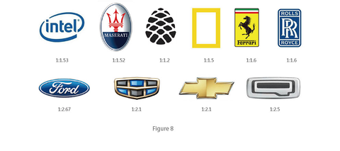
Most international industry line brands use the logo ratio of 1:1 aspect ratio
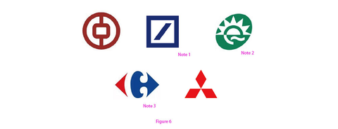
Note 1: Deutsche Bank Logo
Note 2: Quest Diagnostics logo
Note 3: Although the tilted square of Carrefour logo seems to be missing the upper and lower corners, the "C" of "negative" visually fills the upper and lower blanks and looks very full.
Logo form with length width ratio of 1:1
Taking the length of the short side of the logo as a reference, the table is a. if the long side is greater than a, it is the logo ratio of 1:1 +. There are many such logos, but generally speaking, few long sides are twice as large as the short side, that is, 1:2. Most of them are controlled above and below the golden section ratio, that is, about 1:1.618bb. In this way, the logo is relatively compact even if it is not square and full.
Logo case with length width ratio of 1:1 +
Look at the proportion of these big brand logos
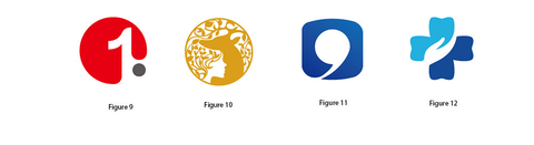
The colored pattern part in the plane space is called "normal shape", while the white colorless part between the opposite normal shapes is called negative shape. The following four student cases are all creative ideas made by using the positive and negative shape method, in which (Fig. 9) the red circle and black dot are positive shape and white 1 is negative shape; (Figure 10) the leaf and deer head are positive, and the white girl's face is negative; (Figure 11) the blue rounded rectangle is positive, and the white comma is negative; Among them (Fig. 12), the Blue Cross is positive and the hand is negative;
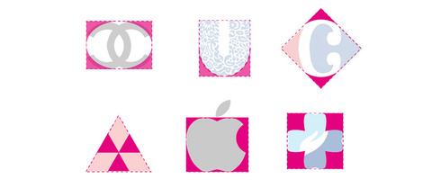
The external geometric structure line refers to the generalization and geometric outline line outside the logo (Figure 13). The pink dotted line shown in Figure 13 is the external geometric structure line
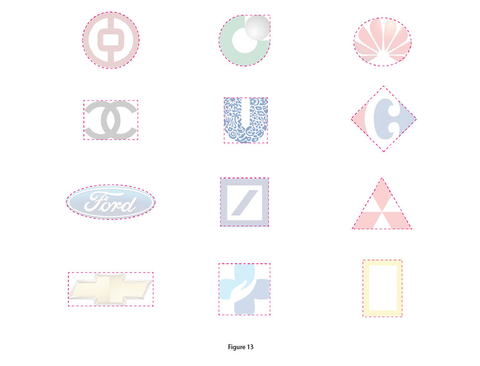
The external geometric structure line must not be the stroke of the logo shape, but the general geometric line outline. Let's see the comparison in the figure below. What kind of external geometric structure line is relatively full

The blank area mentioned here does not refer to the negative area in the logo, but refers to the blank area between the external and external geometric structure lines of the positive shape of the logo. The relatively small blank area, geometric shape or geometric arrangement will make the logo look fuller, as shown in the figure below.
Many junior designers will inadvertently make logos that violate the "plumpness" principle, making the overall logo look loose and incomplete. In fact, there is no problem with the selection and creativity of such logo elements. We just need to adjust to plumpness. Let's take a look at some typical "plumpness" logo cases, find the problem, and then see the results of my optimization, Find out the crux of the problem through comparison, so as to avoid similar problems in our work in the future.
Related posts
A logo that blends text and graphics
Geometric relationship of lines
How to make your logo more geometric