How to make your logo more geometric
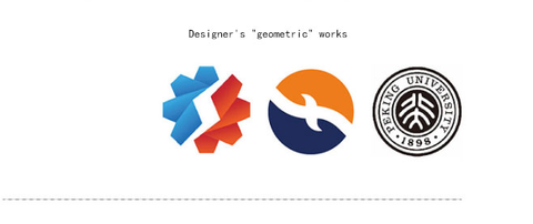
In the field of logo design, the difference in shape is that thousands of flowers bloom. Except for malicious plagiarism, it is difficult to find two logos with exactly the same shape and composition, "Different "In fact, it is also the core value and basic requirement of logo design as an enterprise visual identification symbol, but in addition to being different, logos have many similarities, that is, the basic geometric elements and geometric relationships. You will find that most of the world's most famous companies use very geometric logos. Why? Especially the circle, such as German three in the automotive field Baobenz, BMW, Audi, the world's first industrial and Commercial Bank of China in the banking industry, well-known enterprises in the energy field, PetroChina, etc. even our Peking University is a circle of logos Well, no more nonsense. Let's talk about logo and geometry today.
一、 Why is the logo geometric
When it comes to the geometry of logo, it doesn't mean that we should turn all logos into round or square. There is no only standard in the design field. Many definitions are contradictory in themselves. The reason why the contradiction makes so many people like it. For example, in today's talk about geometry, you can also make a logo that is not geometric. It just depends on the industry and users, Geometrization is only one of the two extremes of contradiction. It is a design direction, and geometrization is also divided into different degrees. So why do we design the logo geometric? Let's talk about this topic first. I'll try to be brief and don't make your eyes tired!
- The world is geometric
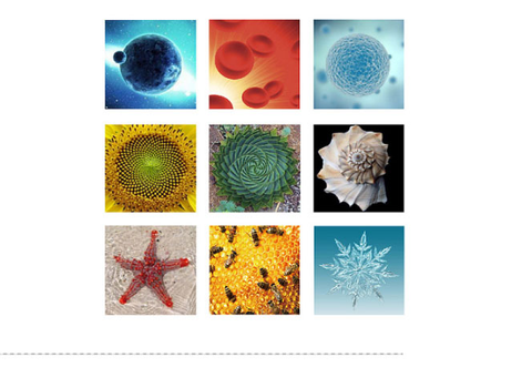
Now when we open our eyes every day, we are dealing with geometry. The light bulb is round, the mobile phone is square, and the ground plate and floor tile are also square. In fact, whether human creation or all things in nature are full of geometric modeling and geometric relations. The most micro and macro substances are the most geometric circles, molecules, atoms, cells, the earth, the sun and even the universe are round, snowflakes hive
It's hexagonal and so on. These perfect shapes like gods are the products of nature like human beings. Since our world is geometric, it's easy to understand that our elite designers use geometric principles to create a new world. It's a tribute to the creator.
Various "geometric" patterns in nature.
- Geometry is the way human beings create the world
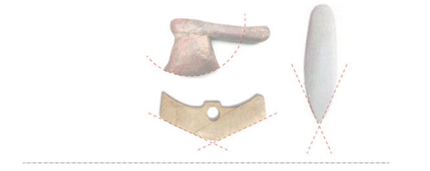
Geometry contains the energy of the universe and is the logic deeply buried under civilization. It is only after understanding the principles of geometry bit by bit that mankind has slowly conquered the world and entered the civilized society. It is geometry that has changed mankind.
Various "geometric" tools of the Stone Age
Ancient wooden wheels and square hole coins

Egyptian pyramids and Chinese houses
These "geometric" creations in different periods promote the development of human civilization. The reason why the products of these civilizations have been inherited for thousands of years and become classics is not because of their geometric beauty, but that these geometric structures are no less important in physics, architecture and other disciplines than the influence of geometric modeling on aesthetics, Each of these "geometric" works contains profound culture. For example, the triangle of "Stone Cone" in the era still represents power. Square hole money is the most vivid representative of the meaning of Chinese wealth. The "pyramid" structure implies stability and team spirit. These models can be seen everywhere in today's logo design industry.
Revise the axe logo of the pharmaceutical industry, the omniscient eye logo on the national emblem of the United States and the square hole money logo of the Bank of China
- Logo design is not the patent of modern people
Before we start this part, let's look at a logo design. Don't be too picky about the font and VI extension of the logo and the business requirements behind it. You can only understand how the logo is made through a short GIF animation.
Yes, you're right. This logo intercepts the geometric patterns of Banpo painted pottery, which is a "logo design" more than 6000 years ago. Will you praise the wisdom and cultivation of the ancients? A group of barbarians who don't wipe their ass when they shit can't eat enough, but they can actually draw such beautiful geometric patterns, which makes us modern people who think we have a lot of culture embarrassed! Maybe you think I'm a little crazy. Does this pattern really have such great charm? In fact, the "geometric" pattern is not only favored by lgoo designers, In the selection of "if design award China 2007", Banpo professional basketball shoes of Li Ning company won "Recreation & Lifestyle" with its outstanding design concept and perfect execution method after conquering the judges in the audience Category if design award. Are you moved after reading this case? If you want to quickly turn over the ancient geometric patterns, which can still be used? Can such cultural treasure patterns be used freely? As long as you're not afraid of the author coming to you in the middle of the night to protect your rights, ha ha?
Before and after Banpo culture, primitive people all over the world recorded their lives in the form of rock paintings. These "graffiti" pictures are in a freehand style, such as the rock paintings of Cangyuan, Yunnan in the following figure:
Rock paintings are "Paintings". Strictly speaking, they use sketching to record events. Of course, later this part of the work was replaced by words. The difference between Banpo's geometric patterns and Han brick patterns and pictures is that the patterns are more concise and abstract, forming a more geometric beauty. Although it can be seen from the above rock paintings that regular triangles are used in the description of the body, But with pure geometry
There are still differences in patterns. Human modeling ability rises from a freehand picture to an abstract geometric pattern. I think it is the difference between art and design, not that designers can't draw, and designers' paintings are different from painters' paintings. The relative content of the picture is complex and random. It is measured by the beauty of the picture, the originality of the creator's drawing techniques and the meaning of the picture content. The pattern is generally the cultural symbol of a certain group, such as the ten thousand characters of Buddhism, the yin-yang fish of Taoism and the cross of Christianity. In fact, these are the earliest logo designs:
Human creativity is infinite. These symbols are the integration of art and philosophy. They use philosophical thinking to interpret the meaning of geometry and a certain culture. In fact, this is what we call creative explanation. These Millennium classics have also been worshipped by future generations. The Nazi logo copied the ten thousand characters of Buddhism (in fact, there are many sayings about the origin of the Nazi logo, which I am not responsible for explaining); Koryo Bangzi stole our Taoist yin-yang fish as a national symbol; The reason why the Red Cross uses the Christian cross pattern as the identification element is that the cross is originally a symbol of shame, because Jesus was crucified on the cross, so the cross represents redemption and healing, which is just in line with the purpose of the Red Cross.
In fact, realistic logos are easy to do, while highly generalized geometric logos need the creator's stronger association ability and graphic control ability. After concise geometric generalization, the visual center is more concentrated and the recognition is unprecedentedly increased, This is also why the worldwide evolution of logos has become a trend. Painters "draw" fewer and fewer logos with pen and paper pigments, while designers "draw" more and more logos with compass triangle.
Geometric process of shell logo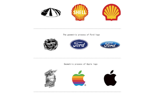

- Modern design geometry is the foundation
From the lines of the shell of the Nautilus to the spiral of the sunflower heart, from the human statue of ancient Greece From the handed down paintings of finch to Notre Dame de Paris in France, the golden section in design geometry and the rational beauty of Fibonacci series are affecting designers from generation to generation. Now the basic teaching of design internationally takes geometric composition as an indispensable basic course of design, and most of the famous logos we see are inseparable from geometry, This part is too complex and will not be discussed here.
Summary: the above content roughly introduces the influence of geometry on design and the difference between art and design in creative techniques. I hope some design beginners can have a more detailed understanding of why we want to geometrize the logo through this explanation. Of course, I hope more friends will participate in the discussion, so that I can learn more.
二、 Method of using "geometry" to design logo
Using geometric principle to design logo, this "geometry" actually has two meanings. One is "geometric figure", such as circle, square and polygon, and the other is "geometric relationship", such as parallelism, symmetry, rotation, juxtaposition, etc. the following is a part of the methods I summarized. Because there are too many methods, it is divided into two episodes. Today is the first part. Less nonsense, let's start!
- Geometric arrangement of geometry
This is the simplest method, because there are only a few basic geometric figures, and there are not so many regular geometric arrangement methods, so this kind of logo is not easy to do, because both basic geometric figures and regular geometric arrangement are non renewable resources, and the key point is to find the good-looking and meaningful "law"
- Cut the geometry
The basic geometric figure has the innate ability to attract eyes, and the shape is full and concise. To cut the basic geometric figure, you only need to master the geometric relationship between the cutting figure and the geometric figure. For example, in the case below, use one line to cut the circle, two lines to cut the quadrilateral, and three lines to cut the triangle. The number of these lines is closely related to the shape of the geometric figure, Another is to find - a feature, such as the change of curve spacing of cutting lines of PepsiCo logo and the negative addition of inner triangle of Reebok. Microsoft dares to make such a quintessence of a square logo because its brand value is too strong, but I think this logo can be used in hardware as a software company There are still some features missing in the. You can see the Microsoft logo in Microsoft Surface book The application effect on is still a little pale.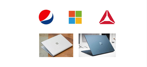
- Geometry text
The text itself has strong geometric features. If it is properly summarized and omitted, and its geometric features are strengthened, it can become a good logo, The word "Chinese" in the logo of the Bank of China in the figure below has become a classic in the world's design works. Suzuki and Shangri La have carried out different geometric transformations on the same "s" elements, and the effects are different. GIF animation shows the geometric process of the word "female". This is the final draft scheme of China Women's society. You can observe the changes of each step.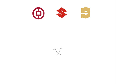
- Add text to geometry
The logo with text as the element has a large proportion in various industries because of its strong brand gene characteristics. In the following cases, I am looking for a round shape. In fact, there are many shapes, so I won't list them one by one. This method doesn't need to be too fierce in the processing of geometric graphics, and the font part still needs some sense of design.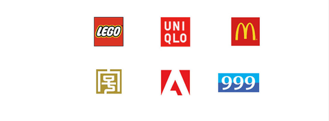
- Add graphics in geometric graphics
In the same sense as the previous one, the elements are added in the geometric figure, but the attributes of the elements have changed. In fact, when you make a logo, you only need to refine an enterprise related element, and then add a circle and a box outside to finish it. This design method tests whether you can design the elements inside and find the relationship with the outer frame. The case demonstrated in GIF animation, yes take out the character elements in the murals of Cangyuan, Yunnan, and add a circle outside. The effect is still good. This element can be seen everywhere. The author has been dead for thousands of years. You can rest assured to use it.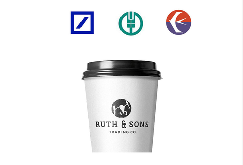
Summary: this part mainly presents the application of basic geometry in logo design.
三、 Expanding practice
The following logo optimization process is to improve the works. You can observe how I use the above methods to redesign. Sometimes the simplest and rough methods often have simpler and rough results. Why don't we use them?

Using a more complete circle to cover the graphics will increase the overall sense of Ogo. In addition, it is necessary to find the combination point of internal and external graphics. How to establish such logic and produce a clever visual effect.

The XC shape of the original design is too complex. I simplified the letters and placed them in a hexagon to further enhance its features through cutting and changing colors. The addition of geometric outer frame makes the whole logo fuller and more integral.
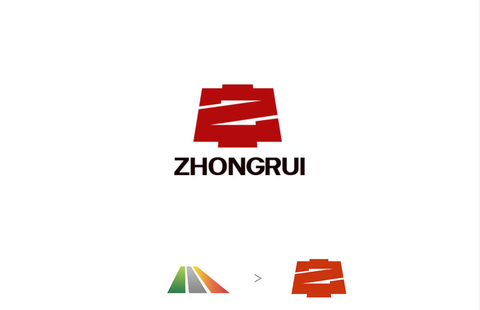
This project is called Zhongrui building materials. The original design does not reflect "Z" and "Zhong". These are three lines and have little connection with the enterprise. You can see how I integrate elements through GIF animation.

1 Comment
Sir,
I am so glad to have, i saw your work too fantastic, sir i’ve request you to please make a full video that how you think the idea, geometry and perfect logo. It will be helpfull. If you yt channel then sir please share the link.
Thankyou